Wastewater Network - Realtime Backoffice User Manual
Configuration area for the Wastewater Network Realtime module
1. Introduction
1.1 Application structure
The application is divided into two main areas: UserView and Backoffice.
This page documents the common interface elements and the full Backoffice area. The UserView area is documented separately in the Wastewater Network - Realtime manual.
1.2 User roles
The system contains three main user roles.
System Admin - full administrative access.
Organization Admin - administrative access within the assigned organization.
Standard User - regular operational access without Backoffice editing rights.
2. Common user interface elements
2.1 Top bar overview
The upper bar contains the standard navigation elements that are used across the application. These elements help the user move between applications, regions, organizations, and profile settings.

Figure 1. Top bar of the application.
2.2 Logo and home page navigation
The logo is located in the upper left corner. Clicking the logo takes the user to the main page.
2.3 Application selector
Next to the logo there is the application name. Clicking the application name opens the application selector menu.
This menu allows the user to move between available application areas, for example Realtime and Realtime Backoffice.
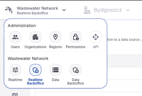
Figure 2. Application selector menu.
2.4 Region selector
In the top bar, next to the application selector, there is a Region selector.
If more than one region is available, the user can select the active region here.
If only one region exists in the current application instance, the Region selector is disabled and appears greyed out.
2.5 Organization name
In the upper right area the application shows the name of the organization for the currently logged-in user.
2.6 User profile menu
On the far right there is the user profile button. Clicking it opens the user profile menu.
From this menu the user can open the profile page, enter Backoffice if access is available, change language, change theme, or log out.
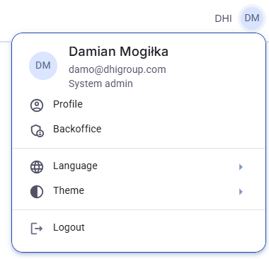
Figure 3. User profile menu.
2.7 User profile page and password change
The Profile option opens the user profile page. This page shows the basic account data and contains the Change password action.
The password change window is opened from that page. The user enters the new password and confirms the change.
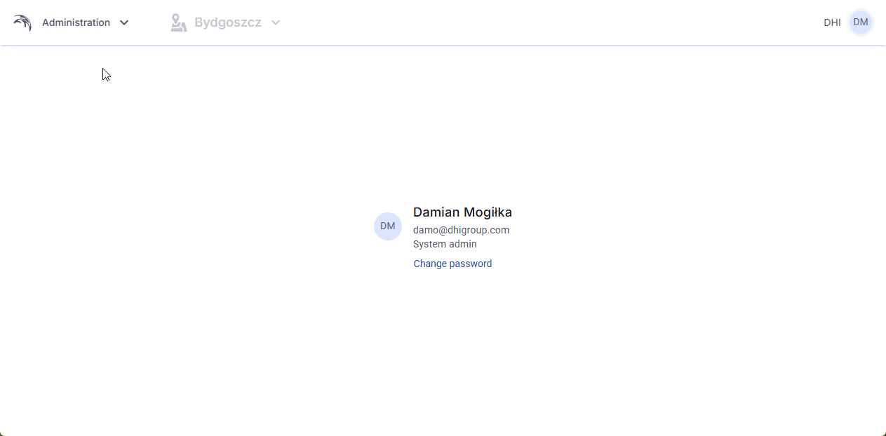
Figure 4. User profile page.
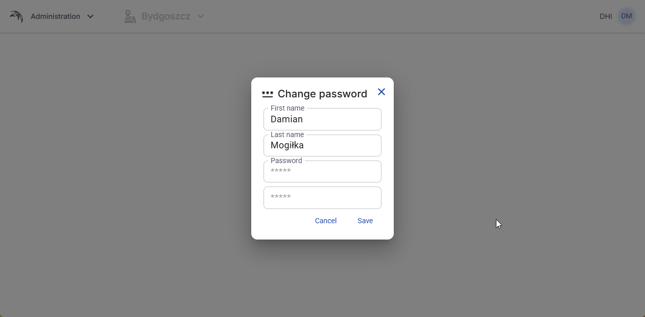
Figure 5. Change password window.
2.8 Backoffice entry from the profile menu
If the logged-in user has the required rights, the Backoffice option is visible in the profile menu. Clicking it opens the Backoffice area.
2.9 Language selection
The Language option opens a list of available interface languages.
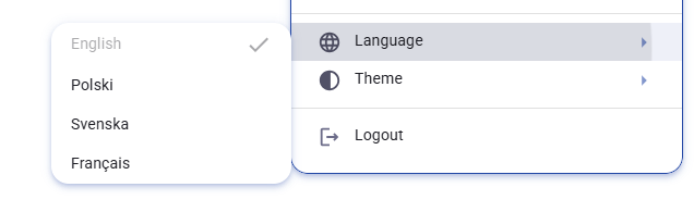
Figure 6. Language selection menu.
2.10 Theme selection
The Theme option allows the user to switch between Light, Dark, and System. The System option follows the theme settings of the operating system used by the person viewing the application.
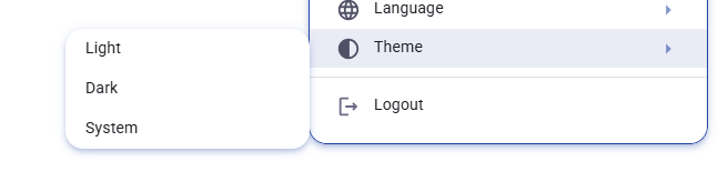
Figure 7. Theme selection menu.
2.11 Logout
The last option in the profile menu is Logout. Clicking this option signs the user out of the application.
3. Backoffice overview
3.1 Who can work in Backoffice
Backoffice can be edited only by Organization Admin and System Admin users.
3.2 Backoffice navigation
Backoffice navigation is displayed on the left side. At this stage the visible tabs are Connectors, Time series, Categories, Map objects, WMS, Indicators, Radars, and Control.
4. Connectors
4.1 Purpose of the Connectors tab
The connector configuration creates a connection to a data source. A selection and configuration can be made to MIKE Cloud or to the local file system where the application is hosted.
4.2 Connectors table
The Connectors tab contains a standard table with existing connectors.
The table shows connector data such as Name, Connector type, and ConnectionString.
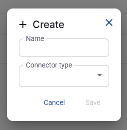
Figure 8. Connectors list.
4.3 Sorting the table
The user can sort the table by clicking a column header.
First click - ascending order.
Second click - descending order.
Third click - return to the default order.
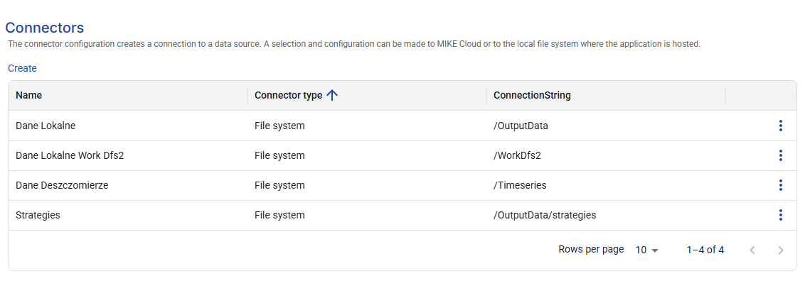
Figure 9. Column options for table management.
4.4 Column menu and table management
Each column contains a context menu opened from the three-dot icon in the column header.
This menu provides table management options such as sort, filter, pinning, hiding columns, and managing visible columns.
4.5 Rows per page and page navigation
Under the table the user can change the number of rows shown per page and move between pages using the page navigation controls.
4.6 Create a connector
To create a connector, click Create and enter the required data.
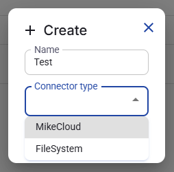
Figure 10. Create connector window.
4.7 Create a MIKE Cloud connector
When Connector type is set to MikeCloud, the user must provide the Service URL and the API key.
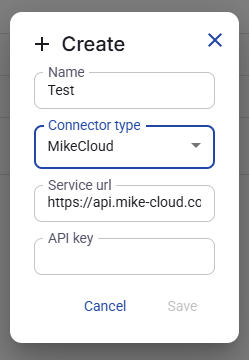
Figure 11. Connector type selection.
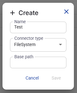
Figure 12. Create MIKE Cloud connector.
4.8 Create a FileSystem connector
When Connector type is set to FileSystem, the user must provide the Base path.
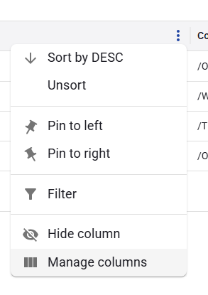
Figure 13. Create FileSystem connector.
4.9 Edit a connector
The context menu of each connector row contains the Edit action.
The edit window allows the user to change the connector settings.
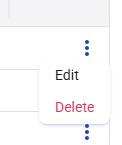
Figure 14. Connector row context menu.
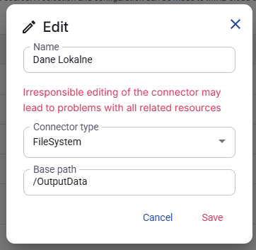
Figure 15. Edit connector window.
4.10 Delete a connector
The row context menu also contains Delete.
Deleting a connector is a cascade delete. If later configuration elements such as Time series depend on that connector, those related elements are also deleted.
Warning
Warning: Before deleting a connector, check whether other configuration elements depend on it. A connector deletion can remove more than one item because the related dependent items are removed as well.
5. Time series
5.1 Purpose of the Time series tab
Timeseries configuration allows for creation of timeseries groups. A group can have timeseries from different data sources, which means from different connectors. After creating the group, one or more sources must be defined. Time series can later be edited for custom naming, unit, and scaling.
5.2 Create a time series group
The first step is to create a Time series group. From the Create action the user only needs to enter the Name.
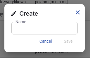
Figure 16. Create time series group window.
5.3 Open, edit, or delete a group
Each created group can be opened by clicking its name. The same group also has a context menu with Edit and Delete. Edit changes only the group name.
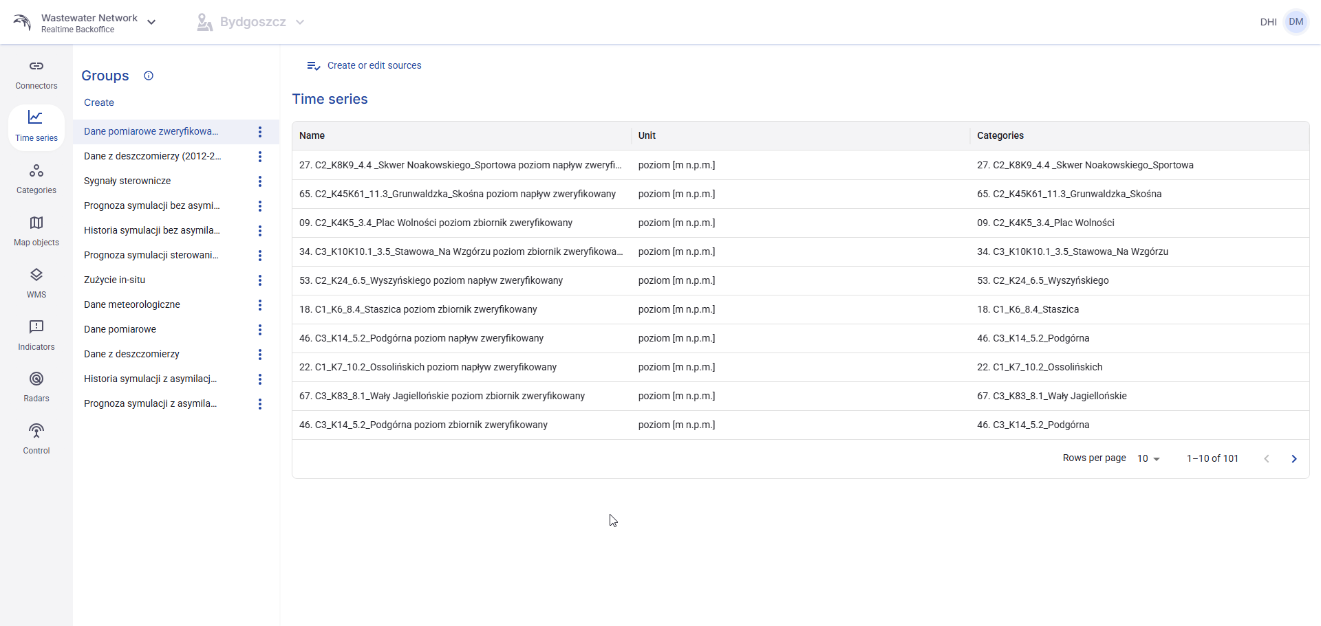
Figure 17. Time series groups and assigned series.
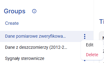
Figure 18. Context menu for a time series group.
5.4 Create or edit sources
After a group is created and opened, the button Create or edit sources appears on the right side. Clicking this button opens the Sources subview.
5.5 Sources view
In the Sources view the user creates data sources for the selected Time series group.
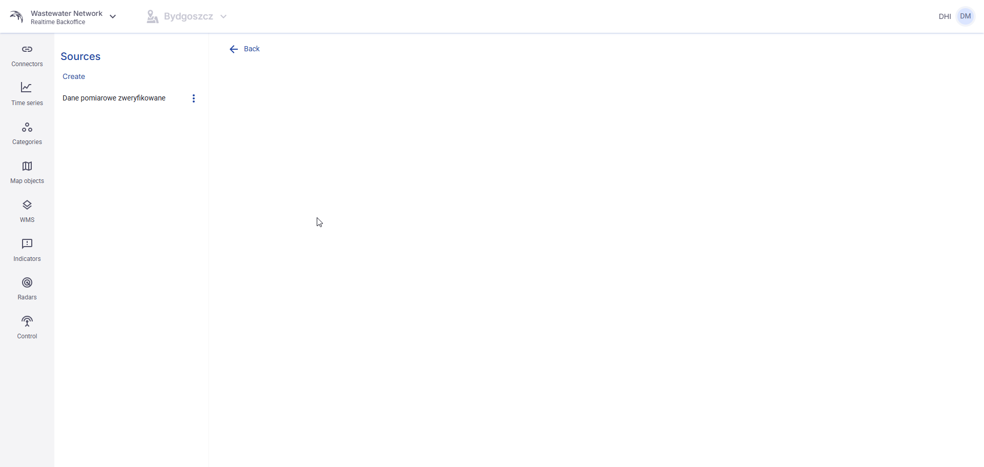
Figure 19. Sources subview for a time series group.
5.6 Create a source
Under the Sources header there is a Create action. To create a source, the user must enter:
- Name
- An existing data connector
- ConnectionString
For local connectors, ConnectionString is the folder name. For cloud connectors, ConnectionString is the GUID of the location.
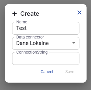
Figure 20. Create source window.
5.7 ConnectionString rules
The value entered in ConnectionString tells the system which location should be read. The exact value depends on the selected connector type.
For a local data connector, use the folder name.
For a cloud data connector, use the location GUID.
5.8 Select time series for the group
After the source is saved, the system reads all objects available in that location and shows them in the Time series table on the right side.
The user then selects which found time series should belong to the current group by checking the related checkboxes.
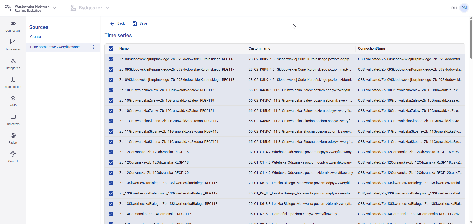
Figure 21. Selecting time series in the Sources view.
5.9 Save the selection and return
After the required time series are selected, the user clicks Save in the upper part of the view.
Then the user can click Back to return to the previous Time series view.
All selected and saved time series from all configured sources become visible in that Time series group.
6. Categories
6.1 Purpose of the Categories tab
A category is a selection of time series which can be grouped flexibly from any Time series group or source. This allows the user to categorize time series.
6.2 Create a category
To create a category, click Create and enter the Name.
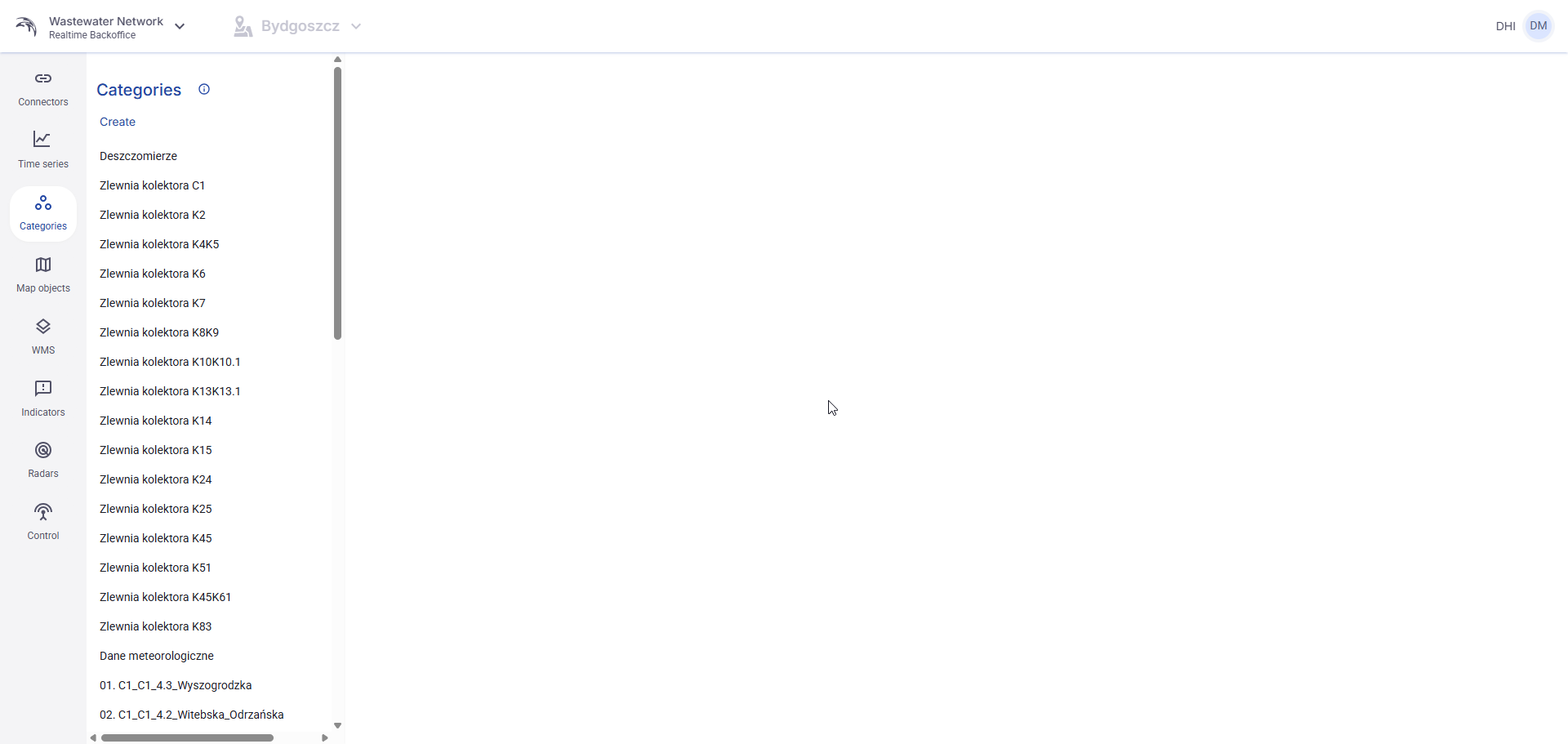
Figure 22. Categories list.
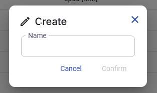
Figure 23. Create category window.
6.3 Open, edit, or delete a category
Each category can be opened by clicking its name. The context menu contains Edit and Delete.
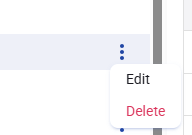
Figure 24. Category context menu.
6.4 Categories / Groups view
The Edit Time Series action opens the Categories / Groups view.
In this view the user selects time series from existing groups. The sum of all selected time series becomes part of the current category.
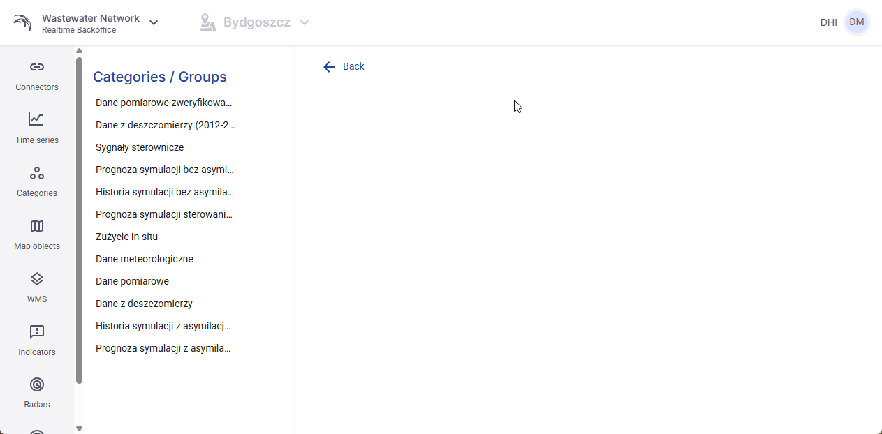
Figure 25. Categories / Groups view.
7. Map Objects
7.1 Purpose of the Map Objects tab
The Map Objects tab is used to configure different visual objects shown in the application map. At this stage the user can work with Map points, Composite points, Visual display objects, GIS layers, and Heatmap settings.
7.2 Map points and Composite points
Map points can be created one by one or in batch by uploading a file. Different Map point types are available, including Flow, Overflow, Precipitation, Level, and Control-related types shown in the provided screens.
A Composite point is a group of already configured Map points. It is used to reduce map clutter. The individual Map points stay hidden inside the Composite point and become visible when that Composite point is selected in UserView.
7.3 Create a Map point
To create a Map point, click Create, set Object type to Map object, and fill in the main fields.
The user must enter the Name, position on the map, and Shape. The user can also decide whether the point should be Highlighted and whether it should Use control.
Highlighted only makes the object name bold in UserView.
If Use control is enabled, the user must select an existing Control mode and provide a unique Control ID entered as text.
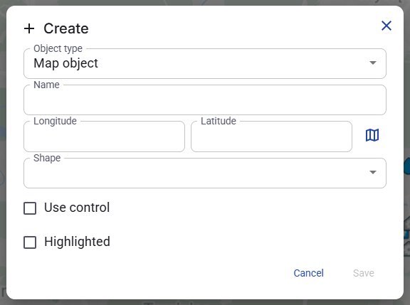
Figure 26. Create Map point window.
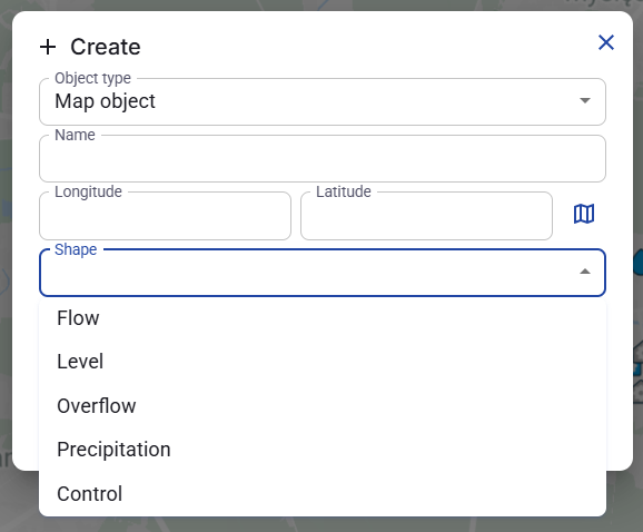
Figure 27. Shape selection for a Map point.
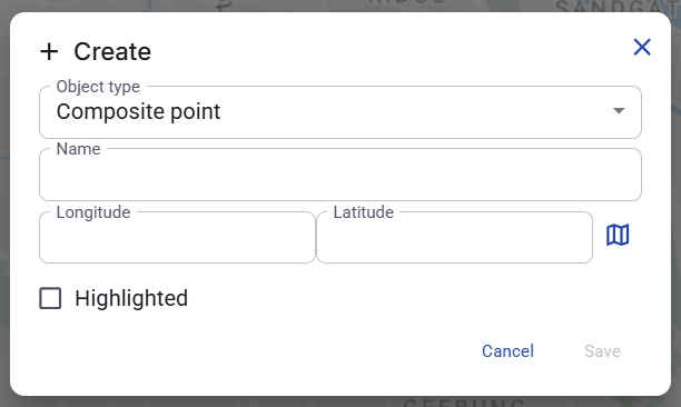
Figure 28. Use control fields in the point creation window.
7.4 Edit a Map point
Every Map point can be edited from its context menu. The edit window allows the user to change the fields visible in the screenshot.
During editing the user can also configure Threshold high, Threshold low, PreTime [h], PostTime [h], and Status time series.
Status time series is the time series used for visualization in UserView. The status of a Map point is reflected by color in UserView.
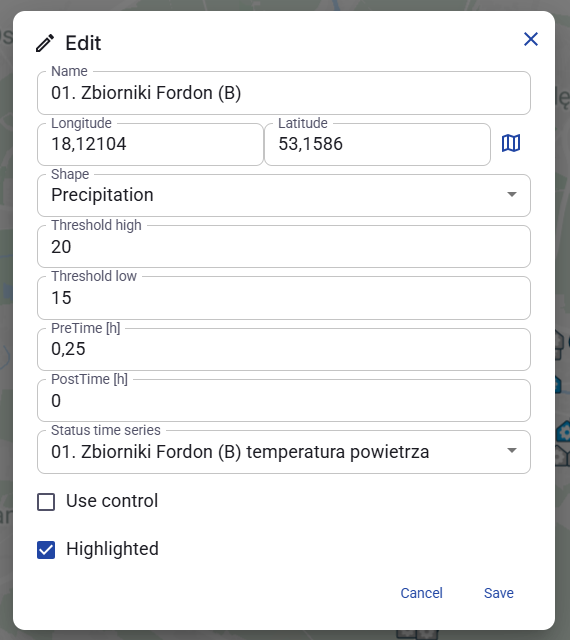
Figure 29. Edit Map point window.
7.5 Map point details
When the user clicks a Map point, a Details panel opens on the right side. This panel contains three tabs: Properties, Time series, and Alerts.
Properties - shows the object properties and allows the user to add Notes.
Time series - allows the user to assign time series that can later be displayed in the Map point details chart in UserView.
Alerts - allows the user to create alerts based on selected time series. These alerts are later logged in the Alerts tab in UserView.
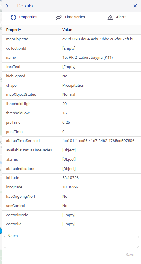
Figure 30. Map point details - Properties tab.
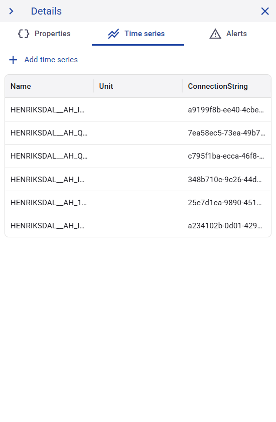
Figure 31. Map point details - Time series tab.
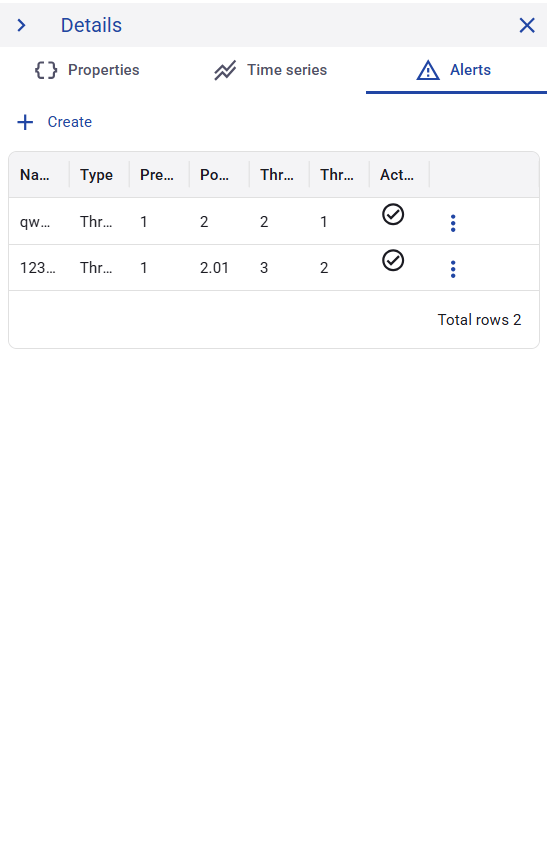
Figure 32. Map point details - Alerts tab.
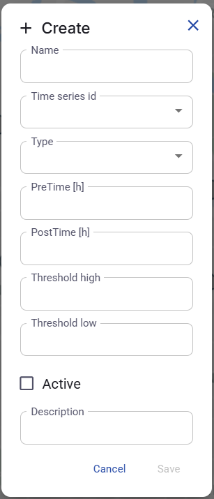
Figure 33. Create alert window for a Map point.
7.6 Composite points
To create a Composite point, click Create and set Object type to Composite point.
After the Composite point is created, existing Map points can be assigned to it from its context menu by using AssignObject.
Detaching a point is done from the context menu of the already assigned point.
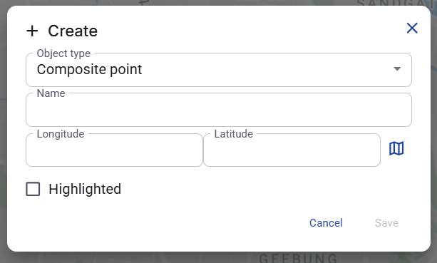
Figure 34. Create Composite point window.
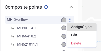
Figure 35. Composite point list with grouped Map points.
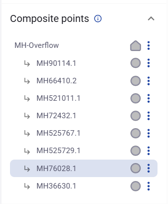
Figure 36. Composite point context menu.
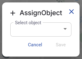
Figure 37. AssignObject window.
7.7 Visual display objects
A Visual display object is used to upload a schematic image or a similar graphic. After the image is uploaded, the user can place points directly on that image. In practice, this is often used for schematic views of physical assets, for example tanks or other technical objects.
To create a Visual display object, the user enters the Name, sets the position on the map, and uploads the image file.
The created object can be edited or deleted from its context menu.
When the object is clicked, the Details panel shows the uploaded image and editable Notes.
Clicking a selected location on the uploaded image opens the creation window for a new point on that image.
For points placed on a Visual display object, the user enters the Name and Shape, decides whether the point should be Highlighted, and can optionally enable Use control. If Use control is enabled, the user must select an existing Control mode and enter a unique Control ID.
A point created on the uploaded image has the same three detail tabs as a standard Map point: Properties, Time series, and Alerts.
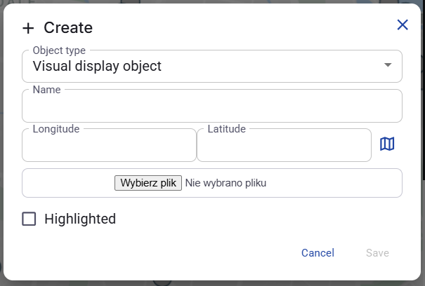
Figure 38. Create Visual display object window.
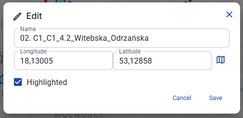
Figure 39. Edit Visual display object window.
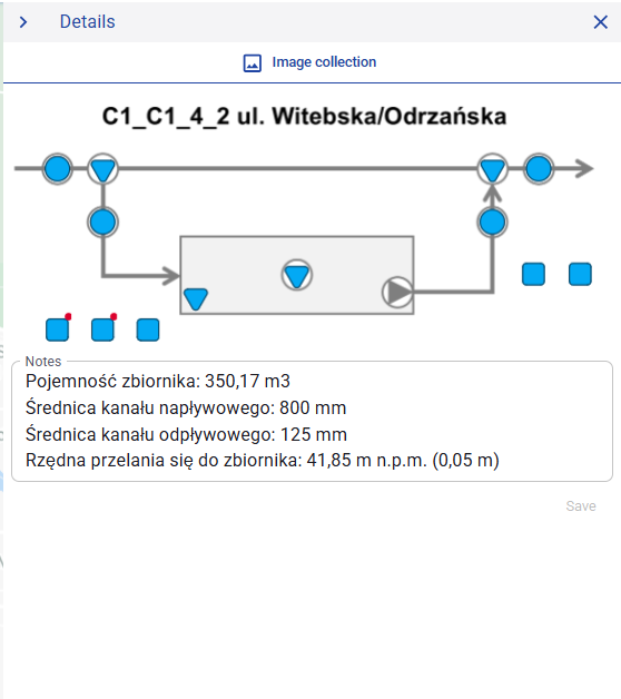
Figure 40. Visual display object details with image and notes.
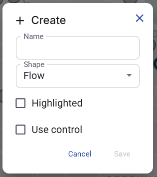
Figure 41. Create point on a Visual display object.
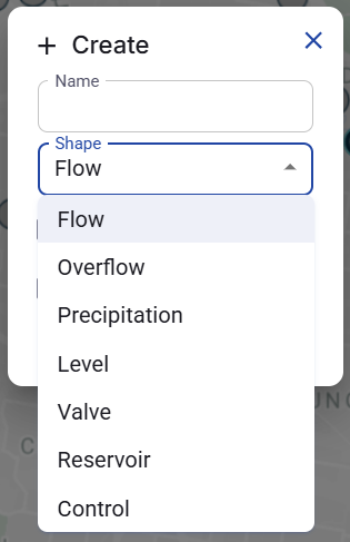
Figure 42. Shape selection for a point on a Visual display object.
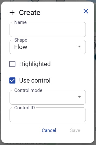
Figure 43. Use control enabled for a point on a Visual display object.
7.8 GIS layers
GIS allows upload of GIS data that is used only for visual display on the map.
GIS objects are uploaded in GeoJSON format by using the Upload action in the Map Objects tab.
Uploaded GIS objects can be edited by changing the Name and Description. They can also be deleted.
Selecting the checkbox next to a GIS layer displays that layer on the map. Clearing the checkbox hides it again.
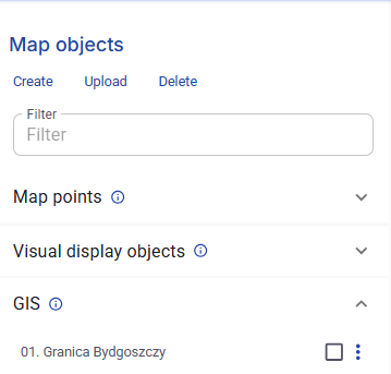
Figure 44. Map Objects view with Create, Upload, Delete, and the GIS section.
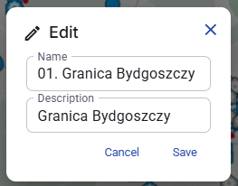
Figure 45. Edit GIS layer window.
7.9 Heatmap settings
Heatmap settings allow configuration of a heatmap separately for each Map point type.
Heatmap can be activated for Flow, Overflow, Precipitation, and Level.
If Heatmap is enabled for a selected point type, the user must define a default color and an accumulated unit, shown as Acc. unit.
The accumulated unit also acts as the default unit for any time series of that type that does not already have a defined unit.
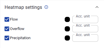
Figure 46. Heatmap settings.
8. WMS
8.1 Purpose of the WMS tab
In the WMS tab, the user creates sources of WMS layers. These sources are later available in UserView for map preview.
To create a source, the user provides a Name and the URL of a WMS or WMST server. If the link is valid, the application loads the available layers from that service.
8.2 WMS sources table
The main table shows the created WMS sources. The table includes the source Name, the server URL, and the number of selected layers.
The table uses the same standard functions as other Backoffice tables, including sorting, rows per page, and page navigation.
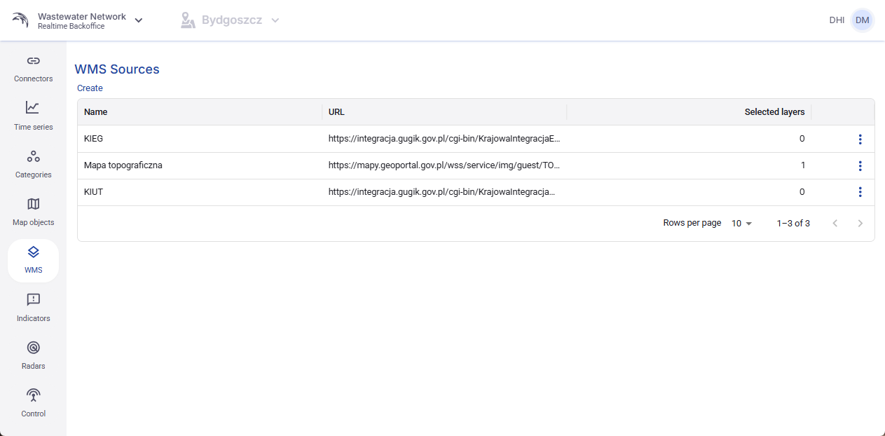
Figure 47. WMS sources list.
8.3 Create a WMS source
To create a new WMS source, click Create. In step 1, called Source, enter the Name and the URL of the WMS or WMST server.
The Next button becomes useful only when the server address is correct and the application can read the service.
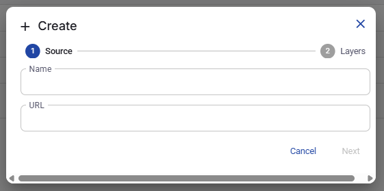
Figure 48. Create WMS source - step 1.
8.4 Select layers from the server
In step 2, called Layers, the application displays the layers available on the selected server.
The user can select any number of layers. After the selection is saved, the chosen layer group becomes available in UserView for map display.
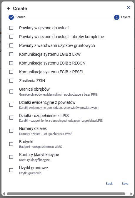
Figure 49. Create WMS source - step 2 with layer selection.
8.5 Edit or delete a WMS source
Each saved WMS source can be edited or deleted from its row context menu. Editing changes the source name. Delete removes the full WMS source from the system.
9. Indicators
9.1 Purpose of the Indicators tab
An indicator creates a bar associated with a Map point. It uses a time series already associated with that Map point.
The indicator can be based on Average, First value, Last value, Min value, or Max value during a selected time span. If Hover active is enabled, hovering over a Map point in UserView shows the active indicator value.
Indicators created here are displayed in the details of the selected Map point in UserView.
9.2 Indicators table
The Indicators table shows the existing indicators and their main configuration values, including Name, Time series, Map object, Min, Max, PreTime [h], PostTime [h], and Getter type.
Min and Max define the minimum and maximum values used for indicator visualization.
This table also uses the standard table functions available in Backoffice.
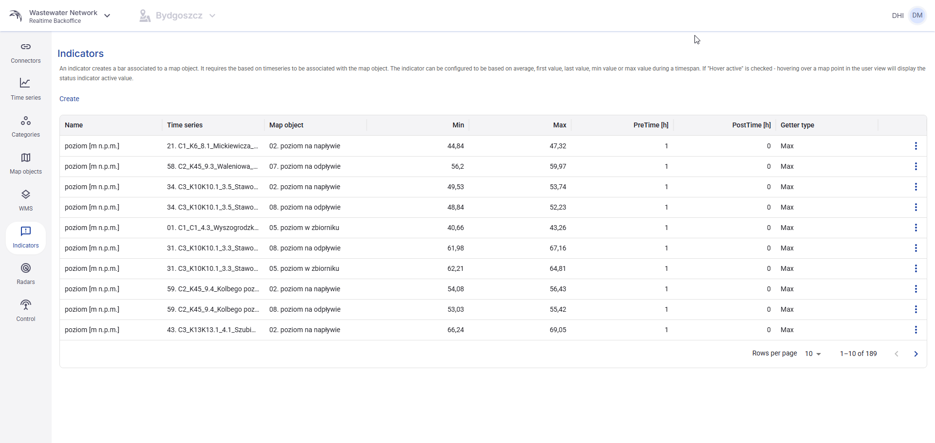
Figure 50. Indicators list.
9.3 Create an indicator
To create an indicator, click Create and fill in the required fields. The user provides the Name, Min, Max, PostTime [h], PreTime [h], Map object, Time series, and Getter type.
The selected Time series must belong to the selected Map point. Hover active can also be enabled if the value should appear when the user moves the pointer over the Map point in UserView.
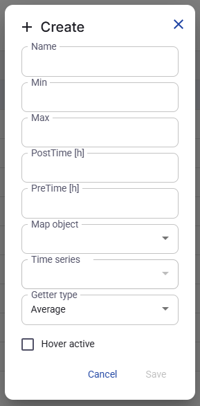
Figure 51. Create indicator window.
9.4 Edit or delete an indicator
Every indicator can be edited or deleted from the row context menu. Editing allows the user to change the same fields that are available during creation.
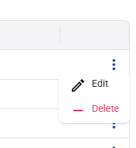
Figure 52. Indicator row context menu.
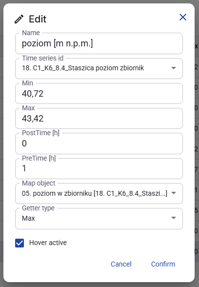
Figure 53. Edit indicator window.
10. Radars
10.1 Purpose of the Radars tab
The Radars tab is used to configure radar sources for UserView.
A radar requires an existing data connector. The selected location must contain supported radar data. After configuration, the radar can be used to display data on the map in UserView.
The main screen contains a list of saved radar definitions on the left and a table of radar connections on the right.
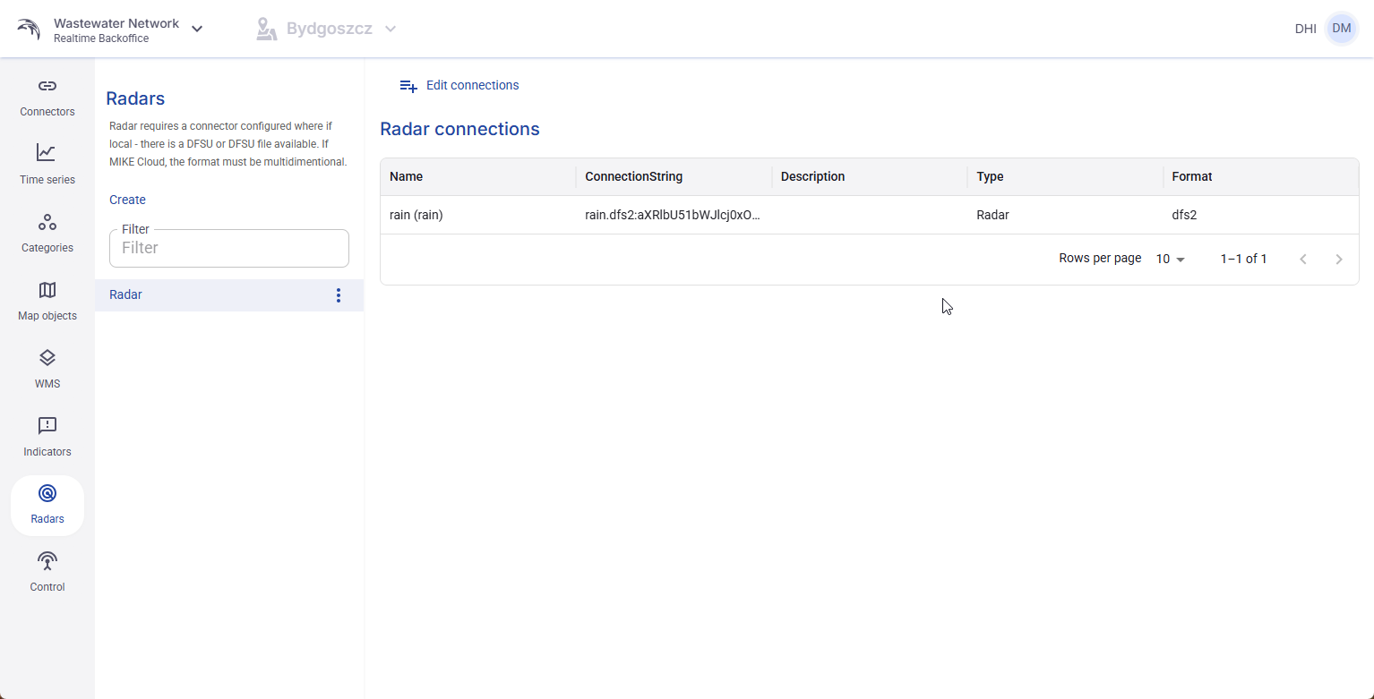
Figure 54. Radars tab with a configured radar and radar connections table.
10.2 Create a radar
To create a radar, click Create in the Radars tab.
In the create window, enter the Name, select an existing Data connector, and provide the ConnectionString.
After the radar is saved, it becomes available in the list on the left side of the screen.
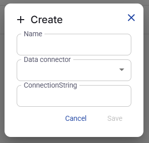
Figure 55. Create radar window.
10.3 Edit or delete a radar
Each saved radar can be edited or deleted. Editing allows the user to change the radar parameters. Delete removes the radar from the configuration.
The list and tables in this tab use the same standard Backoffice functions as other sections, including rows per page and page navigation.
10.4 Edit connections for a radar
After adding a radar, select it and click Edit connections.
The application then shows the multidimensional files found in the selected connector location.
The user selects which files should be visible in UserView by checking them and clicking Save.
Only the selected radar connections are made available for display in UserView.
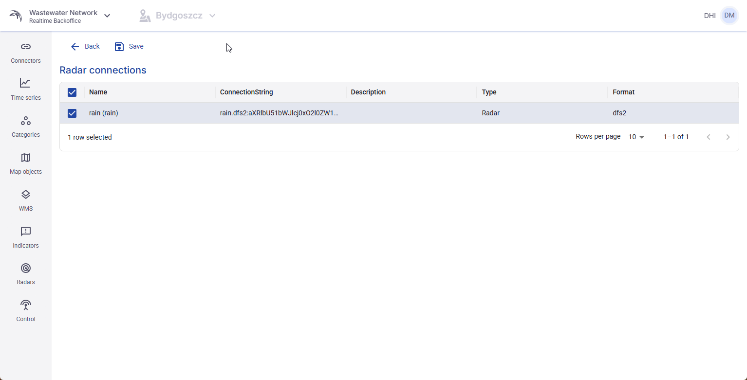
Figure 56. Edit connections view for a radar with selectable files.
11. Control
11.1 Purpose of the Control tab
The Control tab is used to configure control strategies. In the current version of the application, it is used to prepare reservoir control strategies.
At the moment, the application supports only one Control mode: Automatic-manual.
A control rule connects a name, a control mode, a data connector, and a ConnectionString. Inside each control rule, the user can create strategies.
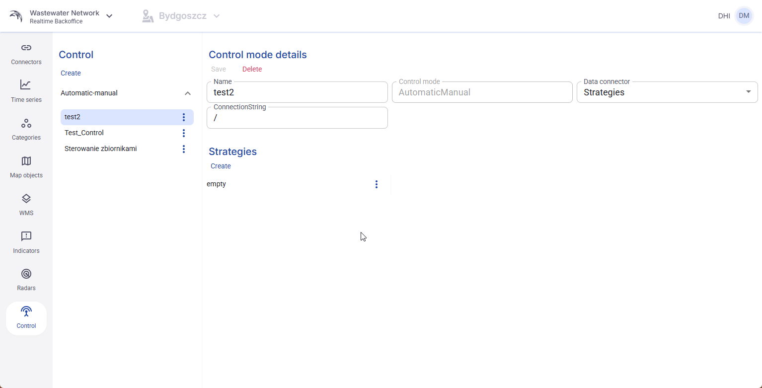
Figure 57. Control tab with control mode details and the Strategies section.
11.2 Create a control rule
To create a control rule, click Create in the Control tab.
The user must enter the Name, choose the Control mode, select an existing Data connector, and provide the ConnectionString.
Because only Automatic-manual is currently available, this is the control mode that can be selected.
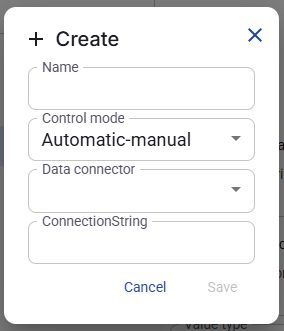
Figure 58. Create control rule window.
11.3 Control mode details
After a control rule is selected, its details are shown on the right side of the screen.
In this area, the user can review or change the Name, Control mode, Data connector, and ConnectionString.
The same area also contains the Save and Delete actions for the selected control rule.
11.4 Create a strategy inside a control rule
Each control rule can contain one or more strategies. Strategies are created in the Strategies section of the selected control rule.
To create a strategy, click Create in the Strategies area.
The strategy window shown in the screenshots contains fields for Strategy ID and Name. It also includes optional settings for Date time enabled, Date time description, Value enabled, Value description, and Value type.
The available Value type options shown in the interface are Text, Integer, Float, and Boolean.
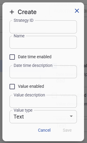
Figure 59. Create strategy window.