Wastewater Network - Realtime User Manual
Operational UserView for the Wastewater Network Realtime module
1. Introduction
1.1 Application structure
The application is divided into two main areas: UserView and Backoffice.
This page documents the common interface elements and the UserView area. The Backoffice configuration area is documented separately in the Wastewater Network - Realtime Backoffice manual.
1.2 User roles
The system contains three main user roles.
System Admin - full administrative access.
Organization Admin - administrative access within the assigned organization.
Standard User - regular operational access without Backoffice editing rights.
2. Common user interface elements
2.1 Top bar overview
The upper bar contains the standard navigation elements that are used across the application. These elements help the user move between applications, regions, organizations, and profile settings.

Figure 1. Top bar of the application.
2.2 Logo and home page navigation
The logo is located in the upper left corner. Clicking the logo takes the user to the main page.
2.3 Application selector
Next to the logo there is the application name. Clicking the application name opens the application selector menu.
This menu allows the user to move between available application areas, for example Realtime and Realtime Backoffice.
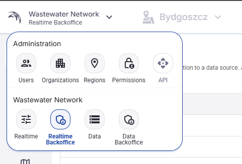
Figure 2. Application selector menu.
2.4 Region selector
In the top bar, next to the application selector, there is a Region selector.
If more than one region is available, the user can select the active region here.
If only one region exists in the current application instance, the Region selector is disabled and appears greyed out.
2.5 Organization name
In the upper right area the application shows the name of the organization for the currently logged-in user.
2.6 User profile menu
On the far right there is the user profile button. Clicking it opens the user profile menu.
From this menu the user can open the profile page, enter Backoffice if access is available, change language, change theme, or log out.
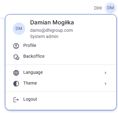
Figure 3. User profile menu.
2.7 User profile page and password change
The Profile option opens the user profile page. This page shows the basic account data and contains the Change password action.
The password change window is opened from that page. The user enters the new password and confirms the change.
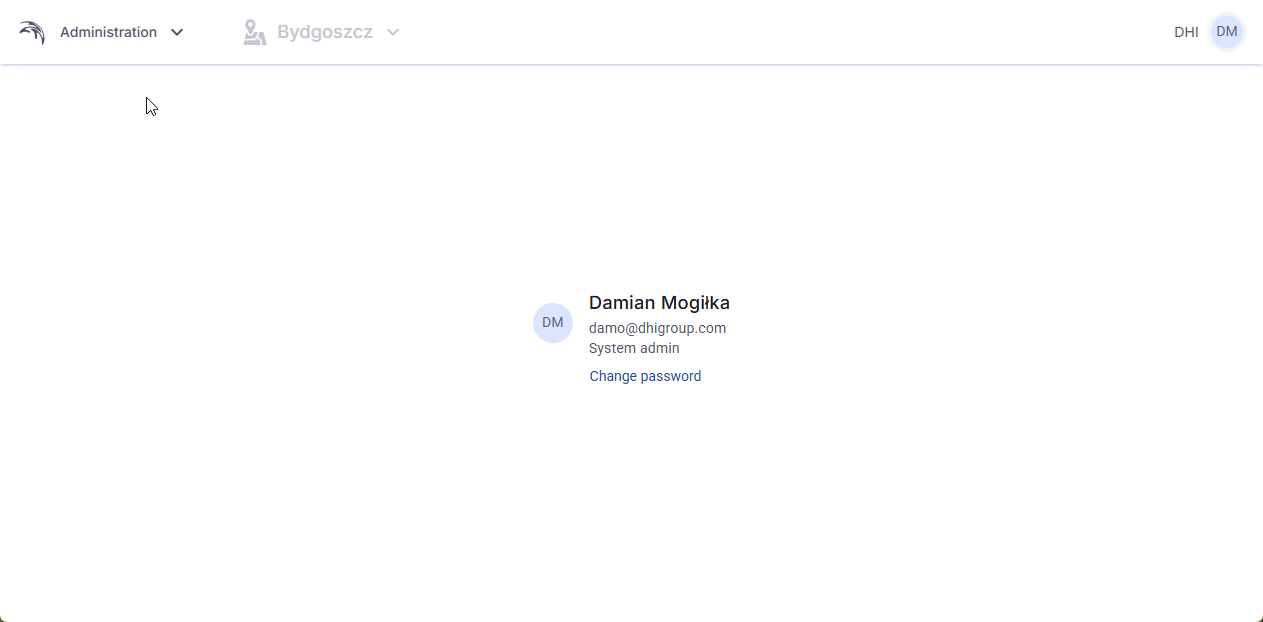
Figure 4. User profile page.
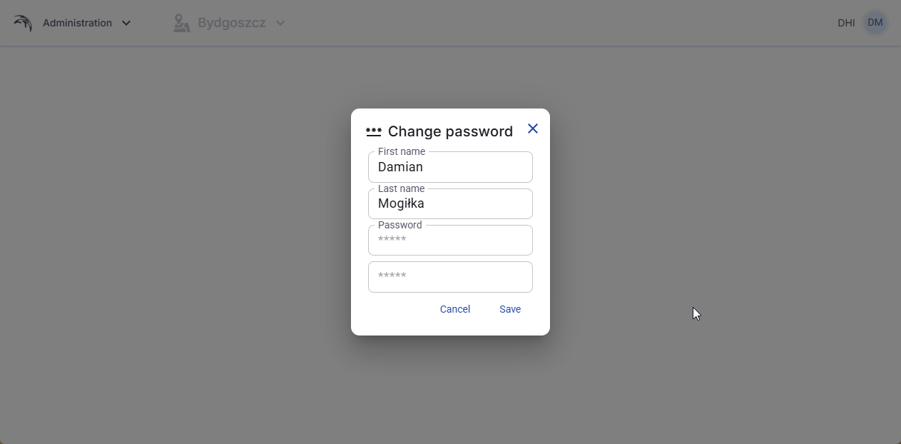
Figure 5. Change password window.
2.8 Backoffice entry from the profile menu
If the logged-in user has the required rights, the Backoffice option is visible in the profile menu. Clicking it opens the Backoffice area.
2.9 Language selection
The Language option opens a list of available interface languages.
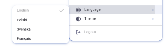
Figure 6. Language selection menu.
2.10 Theme selection
The Theme option allows the user to switch between Light, Dark, and System. The System option follows the theme settings of the operating system used by the person viewing the application.
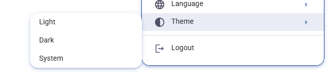
Figure 7. Theme selection menu.
2.11 Logout
The last option in the profile menu is Logout. Clicking this option signs the user out of the application.
3. UserView
3.1 Main tabs in UserView
UserView is the main operational view of the application.
It contains three tabs: Status, Time series, and Alerts.
The Status tab is used to work with everything that is shown on the map. The Time series tab is used for drawing charts from time series. The Alerts tab contains the main table with all alarms available in the system.
3.2 Status tab overview
The Status tab combines the left-side control panel, the main map, and the details panel that opens on the right side after selecting an object.
The left-side control panel contains the filter field and the sections Radar, Map points, Visual display objects, GIS, WMS Layers, and Heatmap settings.
The map shows all configured objects that are currently available in the selected application and region.
When the user clicks a map object, the details panel opens on the right side of the screen.
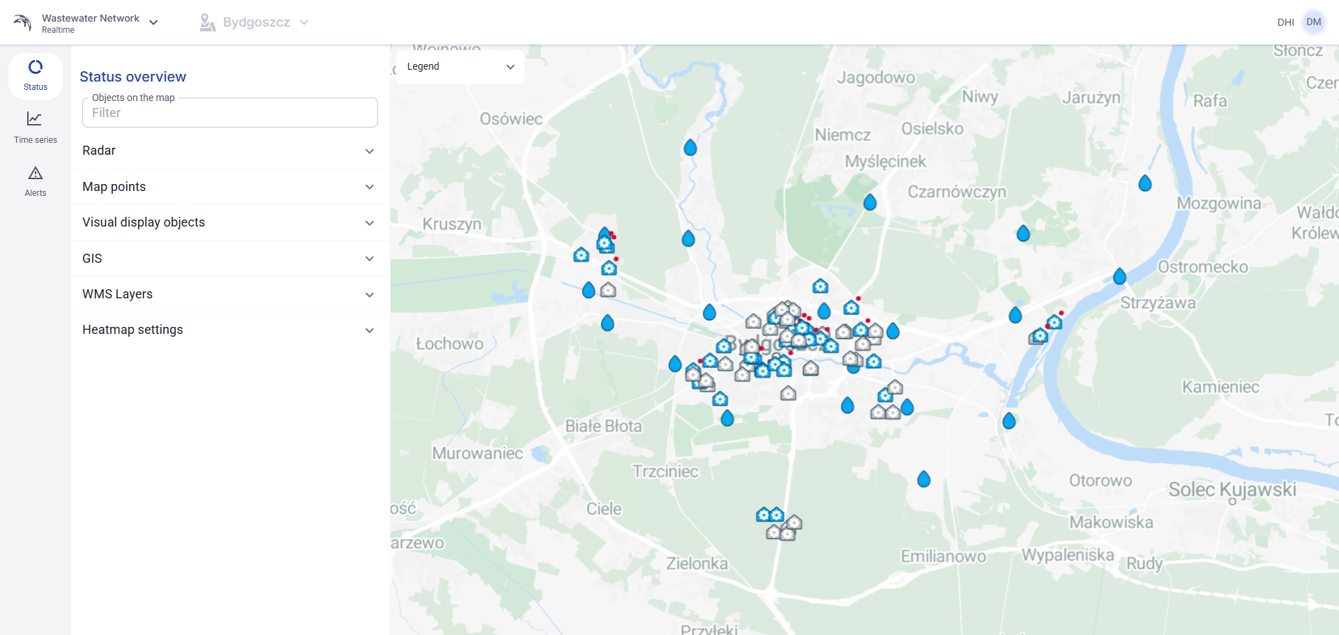
Figure 60. UserView - Status tab overview with the left-side control panel and the main map.
3.3 Filter objects on the map
At the top of the left-side panel there is a filter field called Objects on the map.
This filter works across all objects visible on the map. It is used to quickly find matching objects without manually expanding every section.
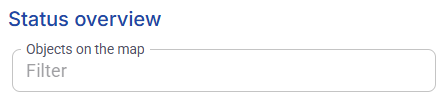
Figure 61. Filter field for objects on the map in the Status tab.
3.4 Radar section
The Radar section is used to turn on one of the radar datasets prepared in Backoffice.
After the user expands the section and selects a radar, the application enables the Time range controls and shows the playback bar under the map.
The time range sliders allow the user to change the visible data window. The visible range can be adjusted interactively within the limit of minus 48 hours to plus 48 hours from the current time.
The user can also click directly on a displayed date and time value and set a custom date and time.
The playback bar below the map is used to control the radar animation. It contains controls for jump to start, previous step, play, pause, next step, stop, loop playback, interactive progress, playback speed, current time, and frame counter.
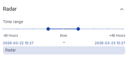
Figure 62. Radar section with the time range selector and the selected radar.

Figure 63. Playback bar for radar animation under the map.
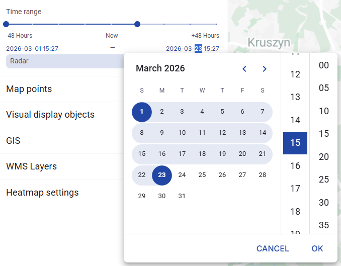
Figure 64. Selecting a custom date and time for radar display.
3.5 Map points section
The Map points section contains the configured map points.
When the user clicks a map point, the application opens the details panel on the right side of the screen.
The details panel contains two tabs: Map object and Alerts.
In the Map object tab there are three sections: Information, Indicators, and Time series.
The Information section shows the configured object data. The Indicators section shows the indicator bars assigned to the object. The Time series section allows the user to choose one of the assigned time series and review its chart.
Inside the Time series section there is also a Show details action. This action redirects the user to the Time series tab and preselects the time series that is currently being viewed.
3.6 Map point details panel
When the details panel first opens, its sections may be collapsed.
After expanding the sections, the user can review the configured object information, indicator values, and the time series chart.
The Alerts tab in the details panel is currently empty.
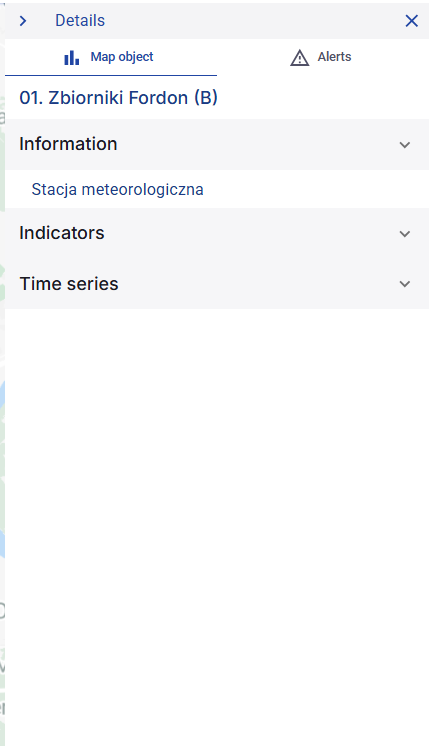
Figure 65. Map point details panel with collapsed sections.
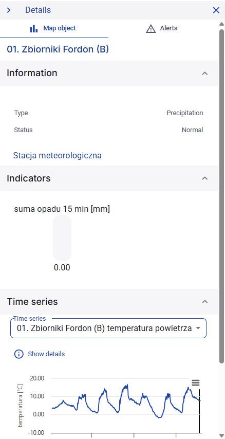
Figure 66. Map point details panel with expanded Information, Indicators, and Time series sections.
3.7 Visual display objects section
The Visual display objects section contains the uploaded schematic objects.
When the user clicks a visual display object, the details panel shows the uploaded image with the configured points placed on top of it.
Below the image, the user can see the note assigned to that object.
The user can also click a point directly on the schematic image or select it from the list on the left side.
After selecting a point inside the visual display object, the details panel shows the same two tabs that are used for normal map points: Map object and Alerts. The behavior of these tabs is the same as for map points placed directly on the map.
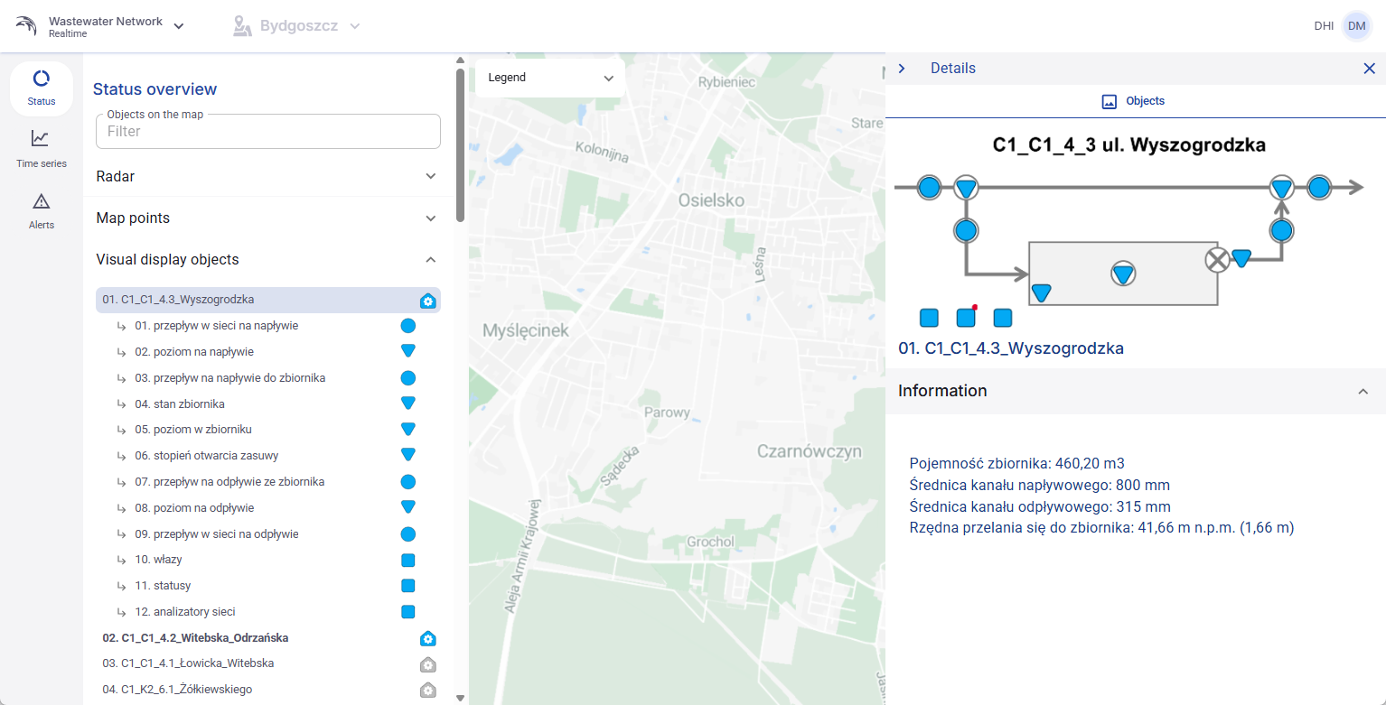
Figure 67. Visual display object details with the uploaded image and object note.
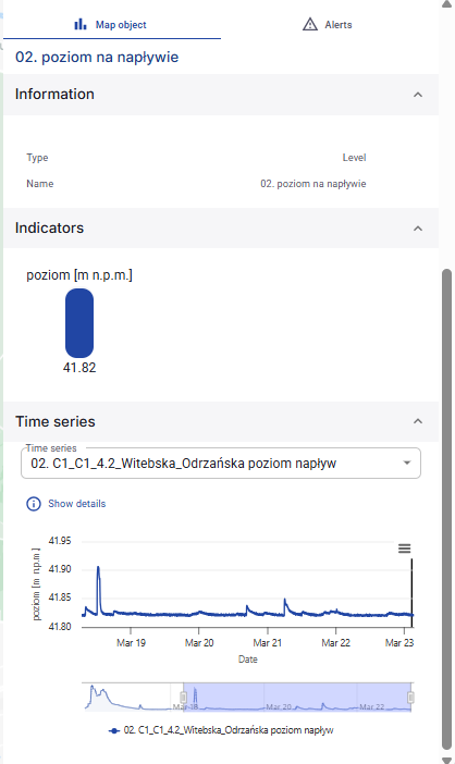
Figure 68. Details of a point selected inside a visual display object.
3.8 GIS section
The GIS section lists all GIS layers uploaded to the system.
Each layer has a checkbox. Selecting the checkbox turns the layer visibility on. Clearing the checkbox hides the layer from the map.
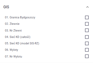
Figure 69. GIS section with uploaded layers and visibility checkboxes.
3.9 WMS Layers section
The WMS Layers section lists all WMS layers made available in Backoffice.
Layers are grouped by the name of the WMS source from which they come.
If a WMS source contains multiple selected layers, UserView shows them together under that source name.
Each visible WMS layer can be turned on or off with a checkbox.
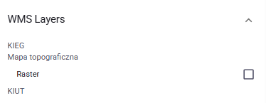
Figure 70. WMS Layers section with layers grouped by WMS source.
3.10 Heatmap settings section
The Heatmap settings section displays heatmap information for the selected category based on the status time series of each point.
This section contains the Show values checkbox. When this option is enabled, the map shows the read values as labels.
The section also contains unit selection and a time range control.
The user can therefore decide which unit should be used for the heatmap display and which time range should be applied to the currently selected heatmap category.
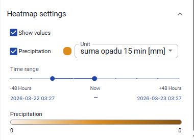
Figure 71. Heatmap settings section with Show values, unit selection, and time range controls.
3.11 Time series tab overview
The Time series tab is used to display one or more selected time series as charts.
The left-side panel contains the selection and filtering tools. The chart area is shown on the right side of the screen.
When at least one time series is selected, the chart is displayed immediately. When no time series is selected, the chart area stays empty until the user chooses one or more series.
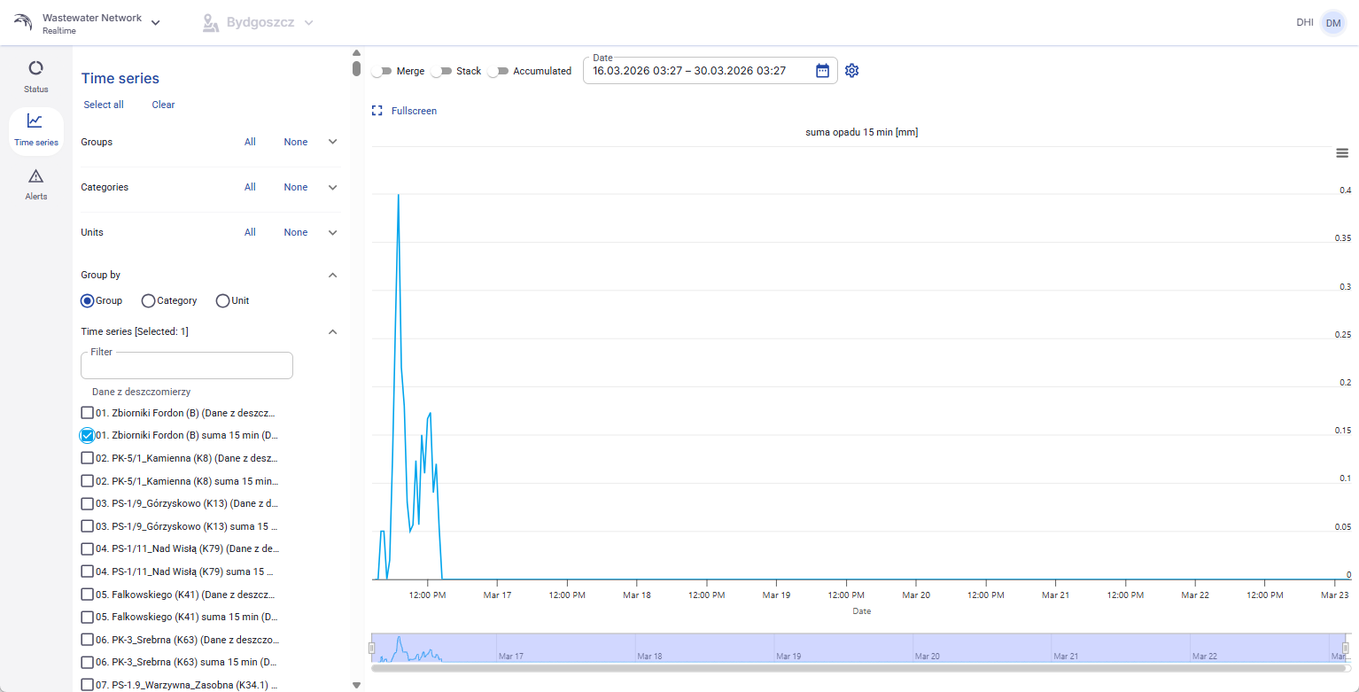
Figure 72. UserView - Time series tab with one selected time series and a visible chart.
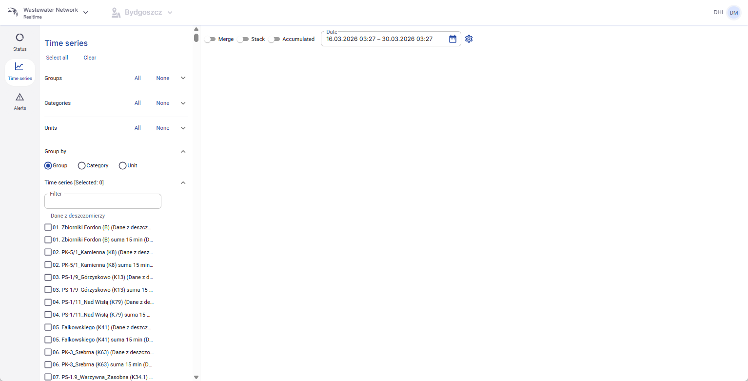
Figure 73. Time series tab with no selected series and an empty chart area.
3.12 Select and organize time series
At the top of the left-side panel, the user can use Select all to mark all visible time series or Clear to remove the current selection.
The filters Groups, Categories, and Units help narrow the list of available time series. Each of these filters provides quick All and None actions.
In the Group by section, the user can decide how the selected list should be organized. The available grouping options are Group, Category, and Unit.
Below these filters there is an additional filter field for the complete time series list. This field is used to search through all visible time series.
Each time series in the list has its own checkbox. Selecting the checkbox adds that series to the chart. Clearing the checkbox removes it from the chart.
3.13 Chart controls and display options
Above the chart, the user can set the date range that should be displayed. The selected date range defines which data is drawn in the chart.
The Fullscreen action opens the chart in a larger view.
The Merge option displays the selected time series together in one combined chart view.
The Stack option changes the chart presentation to a stacked view so the selected series are shown on top of each other instead of as separate independent traces.
The Accumulated option changes the chart to accumulated values across the selected time range instead of showing only the raw step-by-step values.
3.14 Export data from the chart
Each displayed chart includes an export menu in the upper-right corner.
The available export formats shown in the interface are CSV, XLSX, and DFS0.
If the user exports a single selected time series, the application downloads one file in the chosen format.
If the user exports multiple time series at the same time, the application downloads a ZIP archive. This ZIP contains separate files for each selected series and one additional combined file named MERGED.
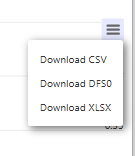
Figure 74. Export menu in the chart view with CSV, DFS0, and XLSX options.
3.15 Interactive chart behavior
The chart is fully interactive.
The user can zoom in and out, reset the chart view, and move the pointer over the chart to display floating labels with the current values.
The chart also contains an interactive navigator area below the main plot. This allows the user to focus on a smaller part of the selected date range without changing the full selection in the main controls.
3.16 Alerts tab overview
The Alerts tab contains the list of all alerts that have been triggered in the system.
This view is table-based. It includes column filters, pagination, and the same standard table functions used in other table views in the application.
This tab is mainly used for browsing and filtering triggered alerts.
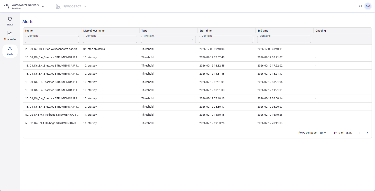
Figure 75. UserView - Alerts tab with filters and paginated alert list.